The Brief
The challenge is to create a promotional poster to advertise the Leeds college of Music Street Food Festival in association with Belgrave Music Hall.
They are looking for a Colourful Design with Street Food Inspired Imagery.
Set Guidelines and information to include:
- A3 portrait
- Full colour
Details for the poster:
- LCoM Mini Street Food Festival
- In association with Belgrave Music Hall
- Friday, May 16th
- Noon - Twilight hours
- Students and Staff Welcome
The poster must also include both logos of LCM and Belgrave Music Hall.
The Audience
Students and staff of Leeds college of Music who may be interested in attending the event.

Saturday, 10 May 2014
Sunday, 4 May 2014
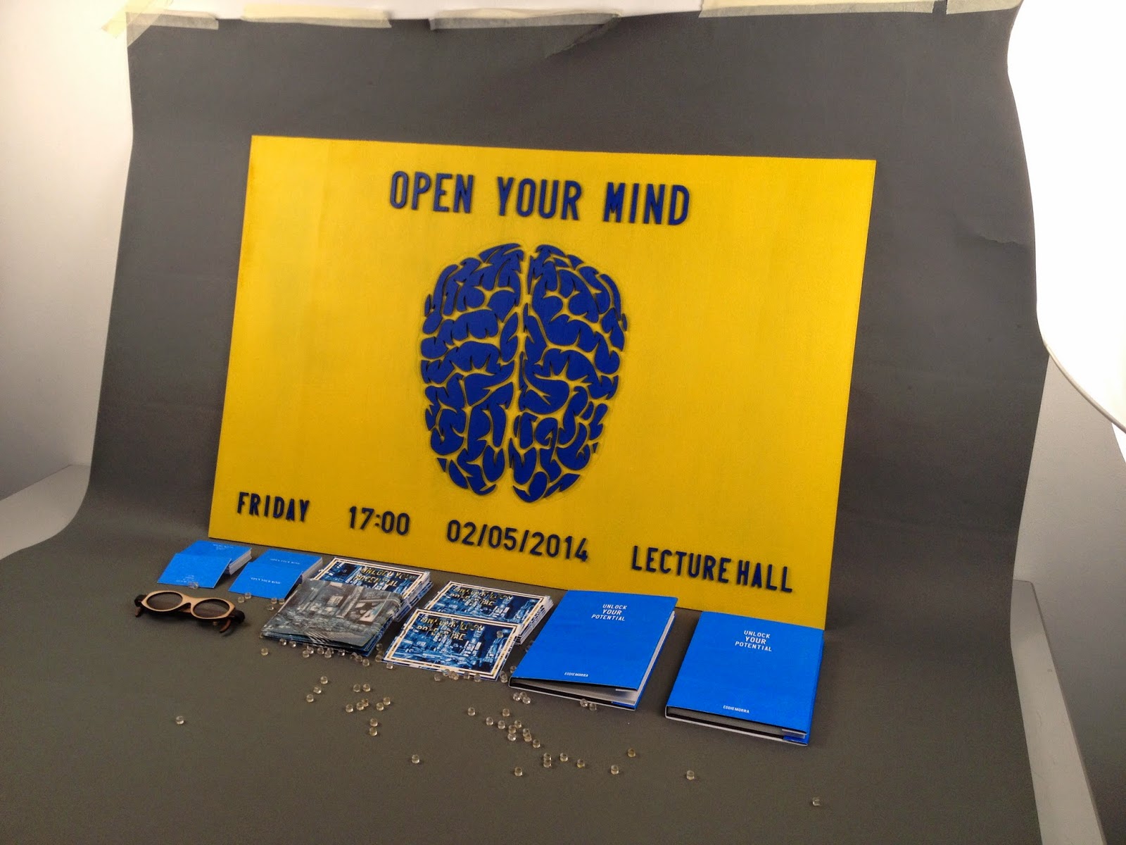
Creative Advertising Film Night promotion // Final products
Below is the full range of our promotional materials after we spent a couple of days getting everything set up and photographed properly with adequate lighting and camera gear.

Blurred Flyer

Tab Flyer

Acetate window Posters


Book


Business card and pill


Collective range of deliverable

Light box sign

In context

Secret Monitor in context


Yellow laser cut poster


Creative advertising Film Night promotion // Production of products
We decided to screen print all of the elements that we could for 2 reasons, first is that this way we can ensure that a consistent colour is used throughout the products, and also as we want to produce many of each of the products screen print allows us to re produce each design simply and quickly.
We produce many of the products together as we both wanted to make sure we were doing it correctly and consistently and we also wanted to make joint decisions on certain matter which we wouldn't have been able to do if we produced the products separately.
We are going to screen the Business cards and the Book design


We decided to letterpress the small amount of text that we intend to include in the book as this would allow us to purchase a empty pre produced book and recreate the same sentence and visuals in numerous books.


The acetate sheets were digitally printed at a cost of £10 per meter so they were quite expensive to produce but the outcome was pretty impressive.


We used the same acrylic paint to paint both the signs and the screen prints, this was we definitely new that the colour would be consistent throughout


We ended up producing 2 different signs out of our laser cut brain design, one of whihc would be presented on a light box to allow the light to shine through and promote the original concept, and we used the negatives of the laser cut piece to create another wooden advertisement where we just reversed the colour.

After we had produced the light box poster to a point where we were happy we needed to find a way to safely present it around the college, we went down to the wood work section to see if we could get someone to make us a mount for the light box.


The mount we got made was brilliant and sturdy at the end, even though it would have been nice to be able to paint the stand, we had just ran out of time by that point and needed to get the promotions out there.

We produce many of the products together as we both wanted to make sure we were doing it correctly and consistently and we also wanted to make joint decisions on certain matter which we wouldn't have been able to do if we produced the products separately.
We are going to screen the Business cards and the Book design
We decided to letterpress the small amount of text that we intend to include in the book as this would allow us to purchase a empty pre produced book and recreate the same sentence and visuals in numerous books.
The acetate sheets were digitally printed at a cost of £10 per meter so they were quite expensive to produce but the outcome was pretty impressive.
We used the same acrylic paint to paint both the signs and the screen prints, this was we definitely new that the colour would be consistent throughout
We ended up producing 2 different signs out of our laser cut brain design, one of whihc would be presented on a light box to allow the light to shine through and promote the original concept, and we used the negatives of the laser cut piece to create another wooden advertisement where we just reversed the colour.
After we had produced the light box poster to a point where we were happy we needed to find a way to safely present it around the college, we went down to the wood work section to see if we could get someone to make us a mount for the light box.
The mount we got made was brilliant and sturdy at the end, even though it would have been nice to be able to paint the stand, we had just ran out of time by that point and needed to get the promotions out there.
Friday, 25 April 2014
Creative Advertising film night promotion // Blurred hand out initial development
First layer to be placed on trace
 Second layer

After printing out this at the early stages to see how / if it would work I quite liked the effect of the trace with the printed text on over the samecolour background, but my only worry would be that the yellow type on the second layer would still be visable and therefore the type could be readable all the time which is not what I want.
I will need to print it properly before I can see if it works but after talking with josh I decided to had a third layer and instead of having type on the trace layers I will just print the image on the trace and only have the type on the last layer so people will have to peel back the layers before they can seethe information.
How I intend the flyer to work


New production method
i will print both a blue and a yellow layer on trace which will be layered up to create a blurred photograph which is all people will see originally.

 The third layer will hold the type as you can see below so once the first 2 layers are pulled away the required information is legible and readable promoting the phrase 'I was bland but now i can see"

After printing out this at the early stages to see how / if it would work I quite liked the effect of the trace with the printed text on over the samecolour background, but my only worry would be that the yellow type on the second layer would still be visable and therefore the type could be readable all the time which is not what I want.
I will need to print it properly before I can see if it works but after talking with josh I decided to had a third layer and instead of having type on the trace layers I will just print the image on the trace and only have the type on the last layer so people will have to peel back the layers before they can seethe information.
How I intend the flyer to work
New production method
i will print both a blue and a yellow layer on trace which will be layered up to create a blurred photograph which is all people will see originally.
Creative Advertising film Night Promotion // Business card
the business card concept comes from this moment in the film you can see below, this is what Eddie is presented with when he is introduced to the drug for the first time, therefore I wanted to try and re create the effect and visuals of the business card in the film, while using it as a tool to promote the film night.

Here are the first variations of the layout and colour, The top one is probably the most closely accurate to the original, but visually it doesn't really work that well


Chosen design
Front

Back

Subscribe to:
Posts (Atom)