From last session I received the feedback that this design below was her favorite design and to take this away and develop the style into a serif version, but also there are areas I am not happy with, like the way I will display both 'photography' and the way the 'I'm' looks within the circle.
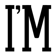
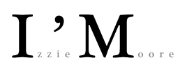
I used the same font used above with is Arvil Sans and played around with adding different sized serifs onto the letter to see if I can create anything which follows a similar shape but highlights her more traditional, delicate photography personality.
I then tried to adjust the width of some of the stems and the shoulder of the m to make it more of a traditional serif M, However at this point I quite liked this idea and continued with it further, and in hindsight, I don't actually liek it anymore and don't think it suits Isobel at all but never mind. I wasted a bit of time but it hasn't effected my progress in the long run of this project
As originally Isobel commented on the fact she liked the thin type rather than thicker, I chose the one above to continue with, however the 2 design below I have adjusted the Height of the caps and also tried an italicised version, but at the minute I am just trying to create a nice variety of options fo her to choose from.
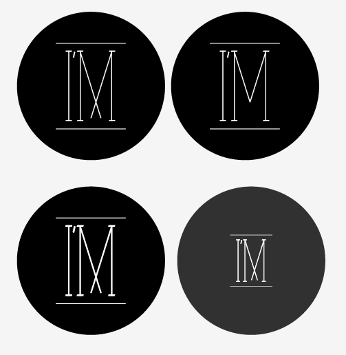
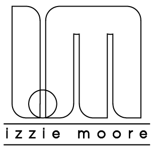
Below are a few variations using the circle to hold the typeface, this was mainly to experiment with how the typeface responded to
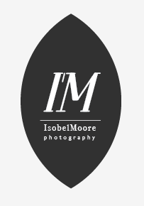
I also tried experimenting with alternate shapes to hold the I'm, again this was purely a visual experiment.
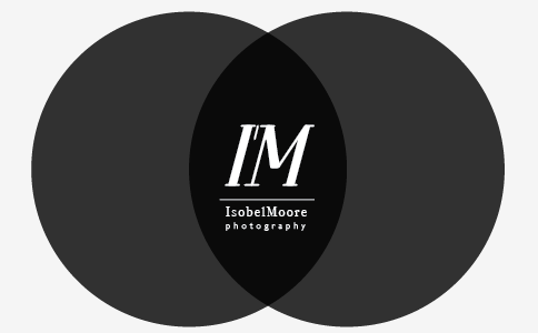
as you can see the design above was originated by the reduction of the design below, which was an experiment using 2 circles playing on lens shape and lens focus, which relates to the photography theme.
The design below starts to take away from the I'm concept but visually i think it fits the high quality,traditional style that Isobel was looking for.
Using a thinner weight I was playing around with the designs below which again I thought gave an interesting visual, but again i think overall it takes away from the I'm concept.
Using this thinner serif font again creates a completely different vibe for the logo but the typeface itself is a nice looking serif font so it depends on Isobel's preference to what direction she wants to follow.
This was an option I sent Isobel earlier which she gave the feedback that she really liked it but it just came across as too busy, which I 100% agree with
I have a meeting planned with Isobel on Wednesday to show her these further options, to see if there are any improvements to the last batch of options.
However at the minute there is non of these designs that really stand out to me, so I am not confident in any of them, so I may have to continue with some completely different options, to see if i can get out of this hole I am digging myself into.
At this stage I have taken away the basic information given to me by Isobel about what she wants out of her logo and visual branding. I have told her that I will go away and come up with a range of about 5 or 6 ideas if possible, to give her a wider variety of choices and hopefully develop a visual brand that we will both be proud of.
Below are the options that I chose to digitise to show Isobel in our next meeting, these are the range I have created which I feel would give her a good starting point of deciding what sort of direction she would like to go in.
I will include her feedback and reactions in this post
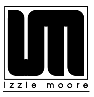
These are the thicker style of block logo which I enjoy creating and would say is my "typical" style of logo design. However i am very aware that this concept I am suggesting, is probably not what Isobel wants, as the image itself once complete comes across as quite loud, masculine and powerful, rather than the more delicate style of serif based logo that she originally suggested.
The feedback I receive for this design from Isobel was as expected, it just doesn't suite her style, which I expected but I wanted to show her a few alternate options as well, which she very much appreciated.
I kind of took this brief of a little experiment as well, as this is the irst time i have worked this close with a client to create their professional branding, I wanted to see what approach would be the best in the initial stages of the design phase, therefore I thought it would be a good idea to throw in options which I didn't think she would choose but might help her think a little further out of what she expects, as i didn't really want it to be a situation where I am just used as a mac monkey. I wanted this collaboration to really show each stage of the design process, and I also want my designers opinion to be considered.
Again the design below was not really considered as an option.
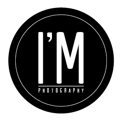
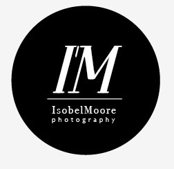
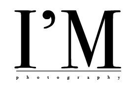
The concept below was the main idea that I approached Isobel with, it focuses more on a brand concept than just a logo. By using her initials I thought it would be an interesting opportunity to use I'M photography as a basis for her photography brand.
I got a really positive response back from her about this proposal, so it looks like this is the direction the concept will head, but the visuals are still to be adjusted.
The use of serif typeface was again met with a positive response, but I will go away and create a few alternate options using slightly different layouts and a variety of different serif options.
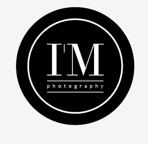
The use of a circle to border the logo was another element she liked, as she agreed that it relates well to a camera lens
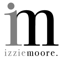
Out of these options I actually prefered this options below, which I think was her least favourite, i thought the fact that using a lower case 'm' works well with the concept, and I prefer the shape of lower case serif M's. I also thought it would have worked quite well on a website or her printed promotional material, but she said that she definitely doesn't want to use lower case letters.
i was quite confident that she would like the visuals of the design options below, but again having found out that she really doesn't want lower case letters, which I think is a shame because visually it works really well, but it does take away from the 'I'm' concept, but I thought visually that is the style that she would have preferred, but that was not the case.
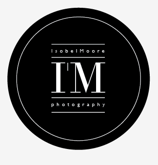
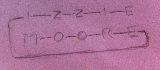
She also really liked the way her name was written below, but she also wanted her full name used in the logo which is Isobel Moore, instead of Izzie Moore, which may effect the way that the type fits as we will now be gaining an extra letter in the first word so may not work as well, but I shall continue developing this further.
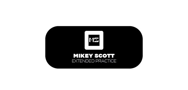
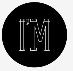
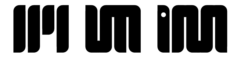
This design below which follows the same layout as one of the earlier examples but with a sans serif font instead, This option below visually was her favorite, so I suggested I will go away and produce a series of variations of this style, trying to use a similar style serif typeface. She commented positively on the thin typeface, and she liked how it fit within the circle.
After our initial meeting i went away and worked on a few possible ideas for Isobels logo, I produced a wide range of possible outcomes, however many of them were either too iledgible or I just felt they really weren't what Isobel was looking for.
I suggested that perhaps it may be beneficial to try out having her own logo with her name instead of just following the typical photography style of branding, which is clean black and white nicely laid out type. However it will obviously be her photography which is the main element she wants to promote about herself, so having a simple logo that doesn't overpower the photography she is trying to present is essential.
The shape of the two z's could work as a camera flash visual, obviously an improvement of the layout would be needed to make it more legible but I think this would be a good option to take to Izzie. I think this style would also suit her style of photography which is interesting studio based beauty and fashion photography.
The I'M concept is I think the strongest concept I have got on paper, I think it would work really nicely using her Initials to form her brand as more of a message of how she approaches photography.
'I'M Photography' would work on several levels, it obviously is based on her initials and still works as if you were reading it 'Izzie Moore Photography' but it also adds the second message selling herself as a professional photographer who cares deeply about her job and in essence photography is Izzie Moore. If she chose this concept she would have the opportunity to broaden it as she develops her promotional materials both digitally and printed. For example, she could extend it to her website, 'I'm Fashion photography', 'I'm Make up Photography', 'I'm a studio based photographer' etc...
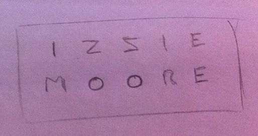
Variations of the layout of her name were also an area I tried to cover, the shape of the two z's and o's could be a visual basis to work around, and as initially this is the type of thing Izzie wants it may be a good feature to work on.
Branded elements Isobel requires
Logo
Business Card
Post Cards
Possible other printed promo ideas
What ever produced should be able to promote and suit Isobel's end of year final show but should also be appropriate to use for her future professional career.
Isobel mostly focuses on
Studio Based Photography
Fashion Photography
Beauty Photography
Make Up Photography
Live Music Photography
She would like an overall feel of versatility with her visual branding.
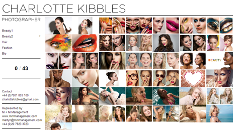
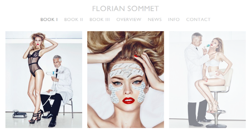
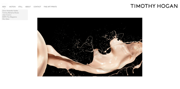
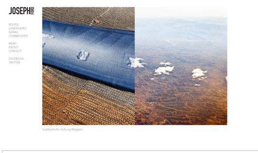
Isobel presented these visual examples of what kind of ideas she has about her personal branding.
all the examples supplied are in Sans Serif fonts but she would still prefer a serif typeface, but perhaps laid out in a similar manner to some of the examples below.
She suggests that perhaps She would prefer her logo to just be her name produced in a smart, clean suitable typeface, rather than have a image or shape based logo, however she has given me the creative opportunity to go away and produce a series of different options, as i think it would be benificial to both Isobel and myself if we experimented with different options, so we can both get an understanding of how each of others work and what elements we would be able to utilise throughout this project.
The range of examples that she has given me suggests that she is quite open to different visual styles, which will allow me to be quite free at the initial stage of the design phase.