Wednesday 21 May 2014
Context Publication // Publication product shots
Here is the final printed version of my Context publication, it has actually come out quite nicely considering it was a bypass tray job, but the prints are clear and the visuals and binding of the book has worked well. I was limited with my stock choice so resorted to Library antique white again as i was impressed with the outcome of my Leeds alphabet publication.


Tuesday 20 May 2014
Context Publication // Completed design
Final Design Context Publication design and layout.
This publication is a journey of Designers, studios and photographers that have inspired me the most over the last 3 years at LCA, certain examples have been used for specific inspiration for individual briefs but overall a majority of the people featured in this publication are constant sources of inspiration or have influenced me in some way.
This publication is a journey of Designers, studios and photographers that have inspired me the most over the last 3 years at LCA, certain examples have been used for specific inspiration for individual briefs but overall a majority of the people featured in this publication are constant sources of inspiration or have influenced me in some way.
Monday 19 May 2014
Leeds Alphabet // Concept boards
This has probably been the most enjoyable brief of the year for me, I have enjoyed all the aspects of it and i'm really happy with the result, both of the alphabet, the photography and the publication, It has inspired me to try to do more of these style of briefs in the future, where I get to use all these different kinds of tools and formats to create a piece of design
ben from ditto inspired this design and I have learnt a lot through doing it.
ben from ditto inspired this design and I have learnt a lot through doing it.
Leeds Alphabet // Publication Product shots
I am not happy at all with the produced outcome of the publication that I have made, I have chosen the wrong binding technique for the amount of pages I have and I have found that the centre pages protrude out of the book and produce an untidy finish. However, I still really like the quality of the prints and think the acutal printed visuals of both the photography and the letters looks really nice and works well together.
I have printed the publication on Antique white paper, which is matt and not grainy so the printed finish is really good, even though it did take 4 hours to print because of problems with the digital printers in the digital dungeon but I am glad I put the time in, but i am still going to get it professionally printed as i think this brief deserves a nice finish.
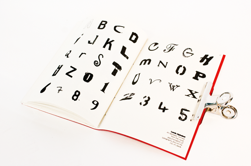
As you can see below here are a few product shots of the final publication, these have actually come out well, much nicer than I expected to get from that publication.


I have printed the publication on Antique white paper, which is matt and not grainy so the printed finish is really good, even though it did take 4 hours to print because of problems with the digital printers in the digital dungeon but I am glad I put the time in, but i am still going to get it professionally printed as i think this brief deserves a nice finish.
As you can see below here are a few product shots of the final publication, these have actually come out well, much nicer than I expected to get from that publication.
Sunday 18 May 2014
Leeds Alphabet // Finished publication design
Here is the final layout and design of the Leeds alphabet publication I have decided to produce it landscape as I think this produces a good layout for each double page spread and allows the viewer to clearly see the letter, information about where the letter was found as well as the original photograph that was used to extract the letter form from.
Leeds Alphabet // Publication Layout and design
This will be the standard layout of my publication, I have designed the booklet as a landscape format, I think is quite a nice aesthetic and allows a double page spread to focus on just one letter form.
I think once printed out this format would be quite a nice feel to flick through and you get both the individual shape of each letter as well as the contrast of texture and colour that comes with each photograph.


I think once printed out this format would be quite a nice feel to flick through and you get both the individual shape of each letter as well as the contrast of texture and colour that comes with each photograph.
Saturday 17 May 2014
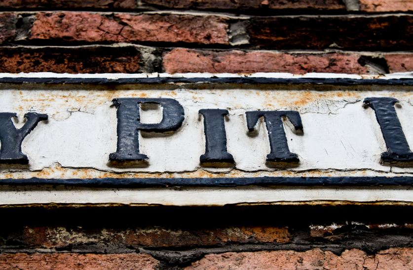
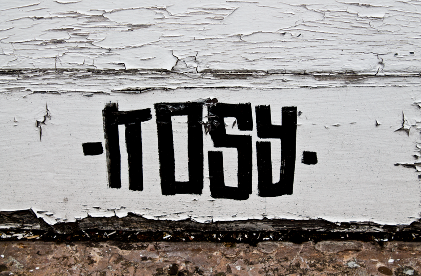
Leeds Alphabet // The making of the alphabet
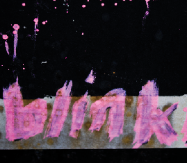
This is how I have been using the photographs I took to extract individual letterforms from each photograph, by using this technique it has allowed me to collect a huge range of completely different looking type to form the complete alphabet while still capturing the essence of Leeds, I will definitely use this method to produce art work again in the future.


Leeds Alphabet // Photography and photo editing
This is one of the first times I've been able to use a high quality digital SLR to capture the imagery I will use in a design, I found out that by using the raw files option then you get a much higher quality of photography, this is what I used while photographing the typography around Leeds.
Once I had collected all the required photographs I then went onto editing them , this is when I discovered that by using 'Camera raw' which is a Photoshop add-on you have a great deal of control over editing your raw images.
By using this i was was both able to edit my photographs to enhance them and it was also a great aid when I was trying to individually extract a letter from a photograph, I could greyscale it and turn up the contrast and black settings and this made cutting out each letter very quick and accurate.


Here are a few examples of my final edited photographs, I have tried to get rich deep colours so that once they are placed into the publication they will create the main element of colour, which will also allow originality on each spread.


Once I had collected all the required photographs I then went onto editing them , this is when I discovered that by using 'Camera raw' which is a Photoshop add-on you have a great deal of control over editing your raw images.
By using this i was was both able to edit my photographs to enhance them and it was also a great aid when I was trying to individually extract a letter from a photograph, I could greyscale it and turn up the contrast and black settings and this made cutting out each letter very quick and accurate.
Here are a few examples of my final edited photographs, I have tried to get rich deep colours so that once they are placed into the publication they will create the main element of colour, which will also allow originality on each spread.
Leeds Alphabet // Concept
Documentation
The method of approach towards this brief is already set
out, however the visual examples that you can see in the top right of this page is the style of photo documentation that I wanted to follow.
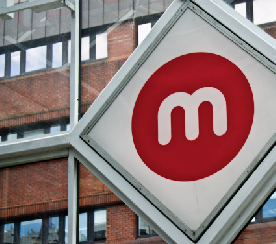
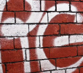
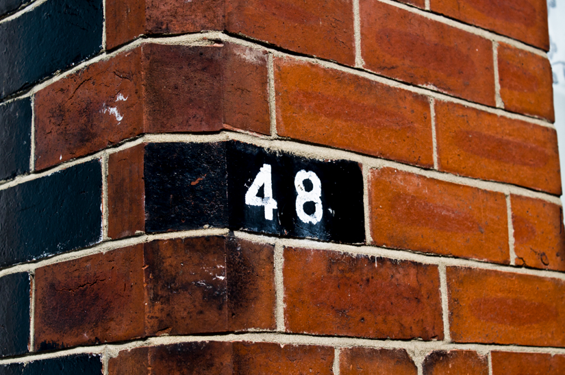
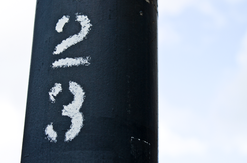
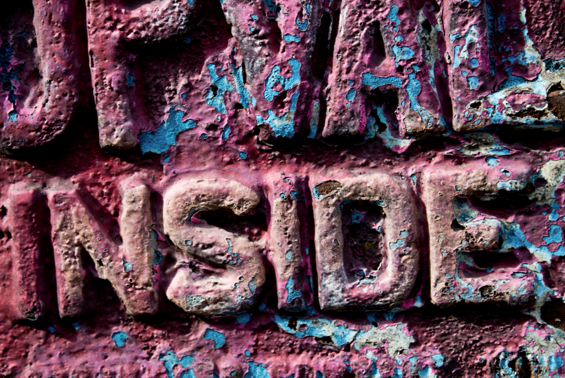
Photographing, typography that usually people ignore like abandoned or old shop signage, graffiti, house numbers etc, will help create a completely unique alphabet.
By changing the angle of the shot and the direction you are looking at the letter form will also morph a typeface even further, so by incorporating the morphed type in different scenarios should help create some interesting outcomes.
Format and Presentation
I intend to produce a complete publication that follows the alphabet and provides the original image that I have taken for each letter form
The result will be an individual letter form that I will extract from the photograph and vectorize accompanied by the original photograph.
A simple booklet is my intended format as this would be easy and cheap to print and produce and would be a suitable format to be sold to art, photography or design
enthusiasts.
The Plan
- Initially start travelling around Leeds, sourcing and documenting as many interesting typefaces as possible.
- ensure that I travel around Leeds centre, Hyde Park and Headingly as these are the most occupied areas of Leeds.
- Select and edit chosen images
- Extract and vectorize individual typefaces until I have a complete alphabet including numerals
- take final alphabet and images and produce a publication that clearly presents the alphabet and it’s concept in a clear and concise manor.
The method of approach towards this brief is already set
out, however the visual examples that you can see in the top right of this page is the style of photo documentation that I wanted to follow.
Photographing, typography that usually people ignore like abandoned or old shop signage, graffiti, house numbers etc, will help create a completely unique alphabet.
By changing the angle of the shot and the direction you are looking at the letter form will also morph a typeface even further, so by incorporating the morphed type in different scenarios should help create some interesting outcomes.
Format and Presentation
I intend to produce a complete publication that follows the alphabet and provides the original image that I have taken for each letter form
The result will be an individual letter form that I will extract from the photograph and vectorize accompanied by the original photograph.
A simple booklet is my intended format as this would be easy and cheap to print and produce and would be a suitable format to be sold to art, photography or design
enthusiasts.
The Plan
- Initially start travelling around Leeds, sourcing and documenting as many interesting typefaces as possible.
- ensure that I travel around Leeds centre, Hyde Park and Headingly as these are the most occupied areas of Leeds.
- Select and edit chosen images
- Extract and vectorize individual typefaces until I have a complete alphabet including numerals
- take final alphabet and images and produce a publication that clearly presents the alphabet and it’s concept in a clear and concise manor.
Leeds Alphabet // The brief
The Brief
Create an alphabet using typography found around Leeds City centre and the surrounding areas.
You can use a combination of photography and typography to create this alphabet.
A large portion of this brief will consist of documenting interesting and unique typefaces. Try not to just go around photographing common shop signage with common digital typefaces. Be experimental with your approach and see if you can open your mind to typography in an everyday environment that perhaps you take for granted when roaming the streets of Leeds.
This alphabet should show people the beauty of all forms of typography and perhaps open their minds to the design around them on their day out in Leeds.
There are no limitations on the format or how you present your alphabet but some form of publication is recommended as this will allow easy viewing for the interested parties.
The Audience
Residence or visitors to Leeds who are inspired by either photography or typography.
No specific age range.
Monday 12 May 2014
Creative Advertising Film Night promotion // Final Concept Boards
Overall this has been a really enjoyable brief, me and Josh have both really worked hard and produced a lot of work for this one brief, there has been areas that we have had to scrape together at the end due to lack of time but to say this brief took us 3 weeks we have produced a huge amount of work.
I think we have worked well as a team, we may have done more things as a couple than we should have but i think this allowed us to be more experimental with out products and also let us work through things together.
The final film night didn't go quite as well as planned as not many people actually turned up HOWEVER this is mainly down to the fact that we couldn't put most of our advertisements around college because of health and safety rules around college and certain electrical items failing there PAT test, which meant that some of the main products such as the secret monitor could not be displayed. and because of problems with health and safety and estates we spent most of the promotion week filling out risk assessments and proposal forms which meant the products we did manage to get out round the college were only up for one or two days before the event. Next time we know that we need to organise and plan our time better when it comes to actually putting the promotions up as there are usually rules and people to be informed. But we will know that for next time.
But i am happy with the quantity and quality of the work we have done and I have learnt so much through doing this brief even how to fill out a risk assessment for putting an acetate sheet on a window.
Sunday 11 May 2014
LCoM Street Food Festival // Completed poster design
Final Design
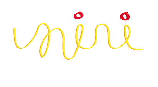
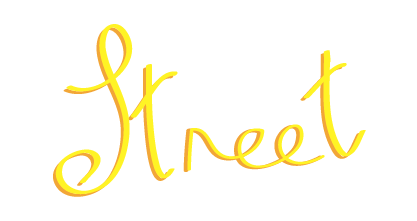
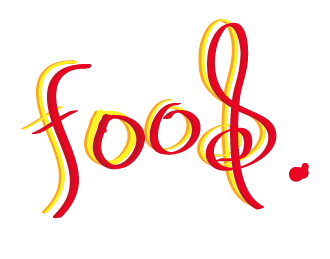
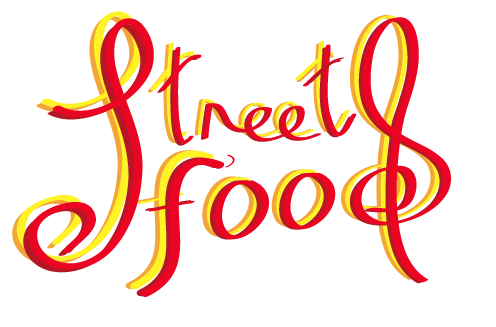
Using a combination of Adobe Photoshop and Illustrator I decided that a combination of both the Ketchup and mustard type and the Promotional street food chalkboard concepts would produce the best outcome.
I have provided illustrations of ketchup and mustard bottles just to highlight the reference to why those specific colours were used and also promote the food side of the festival.
I am overall really pleased with the outcome, and when I sent it too the client they were impressed by the concept but chose to go in a different direction
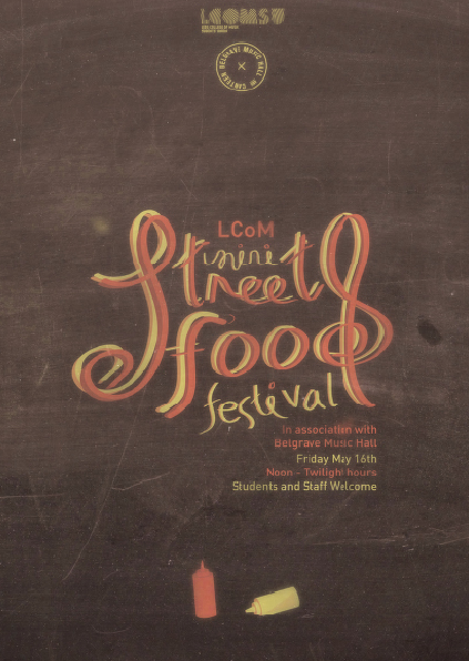
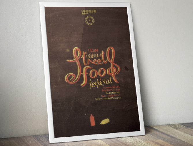
Poster Mock up not in specific context of where the poster would be found but gives a nice visual of how i would intend the final poster to look if printed, this is also at a larger scale than the actual poster but I am really happy with my design over all I think it gives a good clear concept and links well between the music and food element of this event. It is one of the first time I have produced my own type for a design as well and I am really happy with the outcome.
Using a combination of Adobe Photoshop and Illustrator I decided that a combination of both the Ketchup and mustard type and the Promotional street food chalkboard concepts would produce the best outcome.
I have provided illustrations of ketchup and mustard bottles just to highlight the reference to why those specific colours were used and also promote the food side of the festival.
I am overall really pleased with the outcome, and when I sent it too the client they were impressed by the concept but chose to go in a different direction
Poster Mock up not in specific context of where the poster would be found but gives a nice visual of how i would intend the final poster to look if printed, this is also at a larger scale than the actual poster but I am really happy with my design over all I think it gives a good clear concept and links well between the music and food element of this event. It is one of the first time I have produced my own type for a design as well and I am really happy with the outcome.
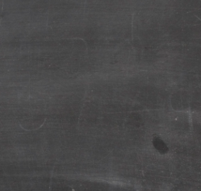
LCoM Street Food festival // Design Development
By using a wacom tablet, I started to create some script text on Illustrator which would both highlight the theme of decorative chalk boards as well as the use of mustard and ketchup as a writing tool.
I tried to incorporate specific elements of music into the type to link both the music and food elements of this brief


I intended to some form of patterned / food related background to work as a base for the typography to sit on
- Table Cloth pattern, is a recognisable and clear link to food, especially cheap looking disposable cloths that you commonly find at street food environments.
- The chalkboard accompanied by the hand rendered script type will create a clear visual that links to street food
- The brown paper bag is a common material that street food containers are served in, this would link well with the ketchup and mustard typography

I tried to incorporate specific elements of music into the type to link both the music and food elements of this brief
I intended to some form of patterned / food related background to work as a base for the typography to sit on
- Table Cloth pattern, is a recognisable and clear link to food, especially cheap looking disposable cloths that you commonly find at street food environments.
- The chalkboard accompanied by the hand rendered script type will create a clear visual that links to street food
- The brown paper bag is a common material that street food containers are served in, this would link well with the ketchup and mustard typography
Saturday 10 May 2014
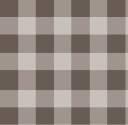
LCoM Street Food Festival // Visual research
Decorative Chalkboards
- Decorative or comical chalk boards are a hugely popular way of promoting individual street food stands and cafés,
- They are unique to whoever designed it and often us vibrant colours, illustrations and typography with an obvious hand drawn feel.


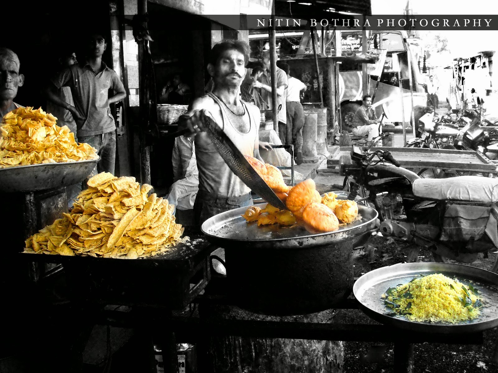
Street food environment
- Street food inspires the imagery of colourful, long, smokey, crowded streets or market places with vibrant foods, sauces and spices plastering every surface.
- The stands that serve street food often commonly promote their stand with colourful signage and furniture.
 Condiments
- Ketchup and mustard is a common colour combination that is associated especially with street food stands.
- The colour combination of Ketchup and Mustard is recognisable towards food.
- Using sauces as a visual tool would create interesting visuals and could be used to create both the illustrations and typography of the poster.


- Decorative or comical chalk boards are a hugely popular way of promoting individual street food stands and cafés,
- They are unique to whoever designed it and often us vibrant colours, illustrations and typography with an obvious hand drawn feel.
Street food environment
- Street food inspires the imagery of colourful, long, smokey, crowded streets or market places with vibrant foods, sauces and spices plastering every surface.
- The stands that serve street food often commonly promote their stand with colourful signage and furniture.
- Ketchup and mustard is a common colour combination that is associated especially with street food stands.
- The colour combination of Ketchup and Mustard is recognisable towards food.
- Using sauces as a visual tool would create interesting visuals and could be used to create both the illustrations and typography of the poster.
Subscribe to:
Posts (Atom)