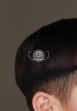
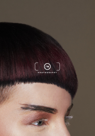
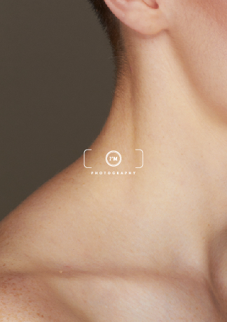
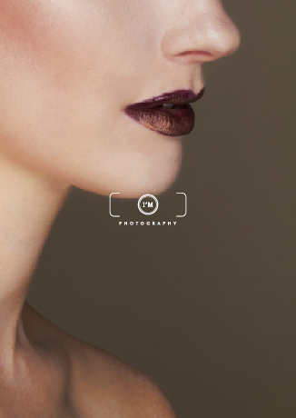
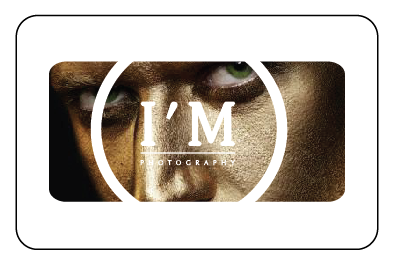
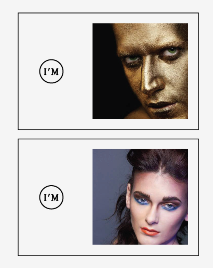
Below is my concept for Isobels handouts that she will be handing out at the end of year show, The idea comes from the view finder concept of the logo, each handout would be a segment of a photograph, as if you were looking through a lens, the photo would be split into 4 quarters and displayed as you can see below.
I made some quick mock ups and thought that when printed well this would work really nicely ad grab attention at the EoYS. However Isobel was worried that people would take all 4 of the handouts instead of just one, which would waste them, but i tried to convince her that it would be eye catching and get her more attention than just a full sized photo with each, as well as the fact it fits nicely with the concept but she wasn't convinced and suggests I use some of her other photos.
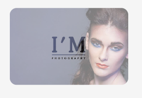
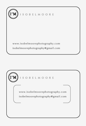
Below is the chosen design to be printed on the back of the handout, Isobel only wanted her contact detail, so it is basically just an A5 Business card.
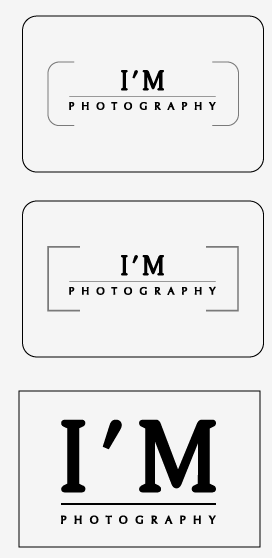
2 alternate variations for the layout on the back of the handout.
Sunday 30 March 2014
Saturday 29 March 2014
Isobel Moore Photography // Final business card design and mock up
After a good couple of weeks of deliberation I think we have finally come to a conclusion of a finished card design, so they have now been sent to Isobel which will be sent to print and promoted at the end of year show and after in her professional career.
The card has a different variation of the logo on each side to highlight the concept of I'M
The result of the final business card, I have made this mock up as I;m not sure the cards will be printed by the time we have our hand in so the stock may be a different tone and texture but I am overall happy with the outcome of the cards and i am glad that I have produced something that the client is happy with.
Sunday 23 March 2014
YCN Cath Kidston // Final Boards sent to YCN
Here are my final boards I sent through to YCN, I have tried to explain each aspect of my concept and the reasons I have made these decisions and why I think it applies to the brief.
YCN Cath Kidston // Pattern in context
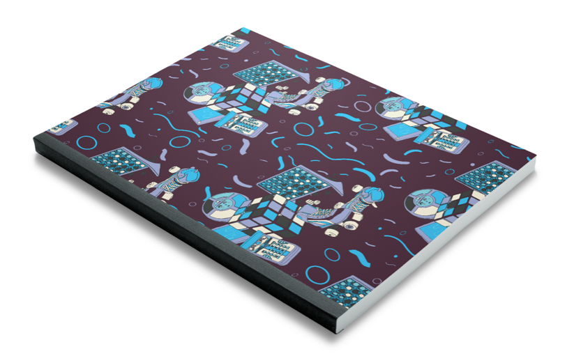
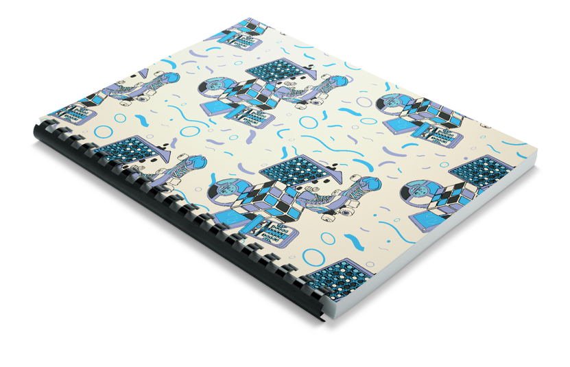
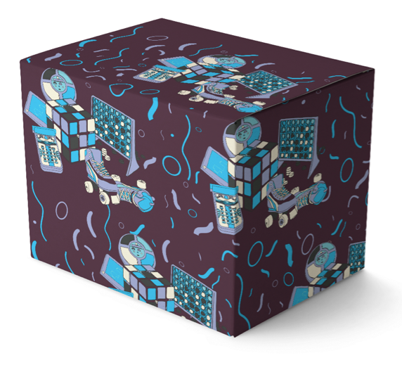
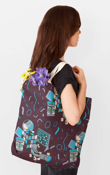
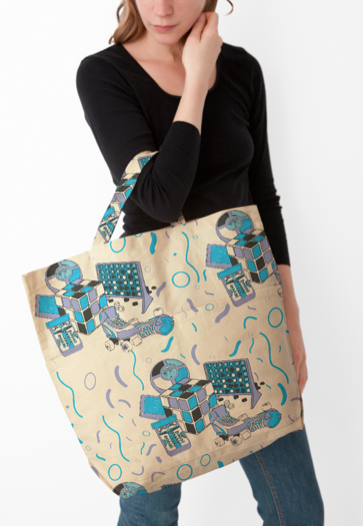
Below are a few examples I have mocked up to give an idea of how the pattern would look applied to a few different possible products that Cath Kidston may choose to print it on, In hind sight I am not sure this is the same kind of conversational pattern that they were looking for, as the patterns they gave as examples were very story board like and this is more of 'just a pattern' however I still think it works really well as a pattern and think i have hit the style, design and concept that would suit the Cath Kidston target Market
Stationary
Home
fashion / accessories
Stationary
Home
fashion / accessories
YCN Cath Kidston // Possible tiled pattern
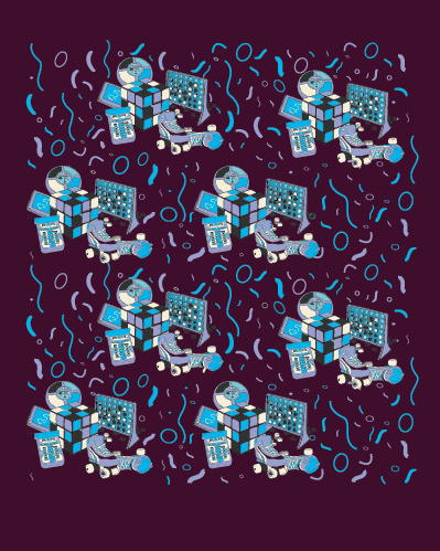
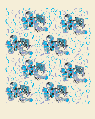
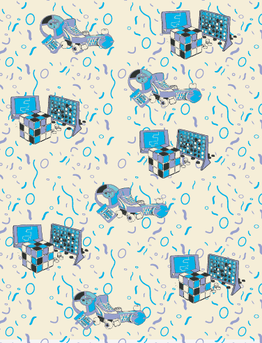
Below are a few options for the possible layout of the pattern. I have added a background pattern which will form a platform for the tiled illustrations to sit, it follows another visual 80's theme of a confetti like pattern which was common and in fashion in the 1980's
I think I am going to present 2 colour variations of this pattern when I send it in to YCN, i think that it suits it in both colours and could create further options for the design
I tried another layout whee the illustrations are split in 2 separate groups and tiled in that fashion, however I think it looks better in the layout above with them all together, it creates a fuller toy box like feel to the pattern.
YCN Cath Kidston // Vectorised illustrations and colour scheme
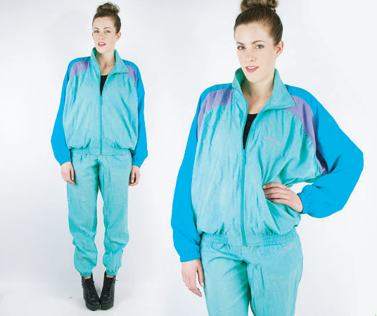
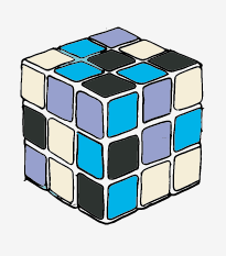
After scanning in the images I used the shape tool to allow easy filling of colour when on Illustrator, at this point I knew I wanted some kind of 80's themed colour scheme, and new that bright vibrant in your face colours were often used, this then led me onto thinking of 80's tracksuits and the colour combinations of them, which are another item which a child of the 80's more than likely would have owned and the colour were often very similar
I chose to use the tracksuit colours you can see below as a basis for my colour scheme, there is a limit of a 12 colour use in this brief and I personally think that is too many colours to allow good aesthetics and consistency throughout a pattern so I want to use much less that that
I have chosen 10 colours to use including a variation of black and white which are more cream and grey but having applied the colours to my illustrations I think they work nicely and also give off an 80's vibe which is what I was going for.
Vectorized illustrations with applied colour scheme.
To say this is the first illustration brief I have ever done, I am actually quite happy with a majority of the outcomes, however I still do no believe that it is a strong point of mine in the design field. I enjoy to draw in certain animated styles but i don't think I enjoy this style of design enough to use it consistently
YCN Cath Kidston // Initial illustrations
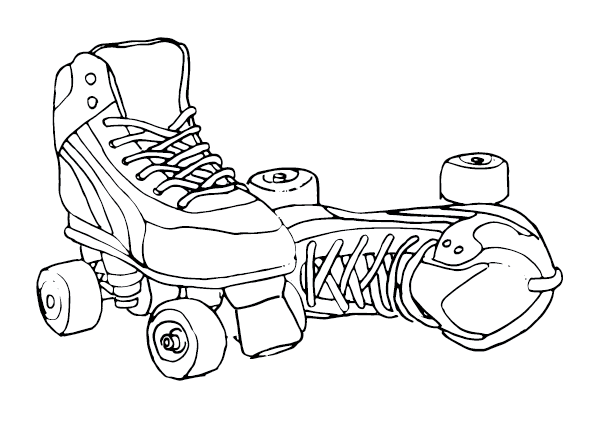
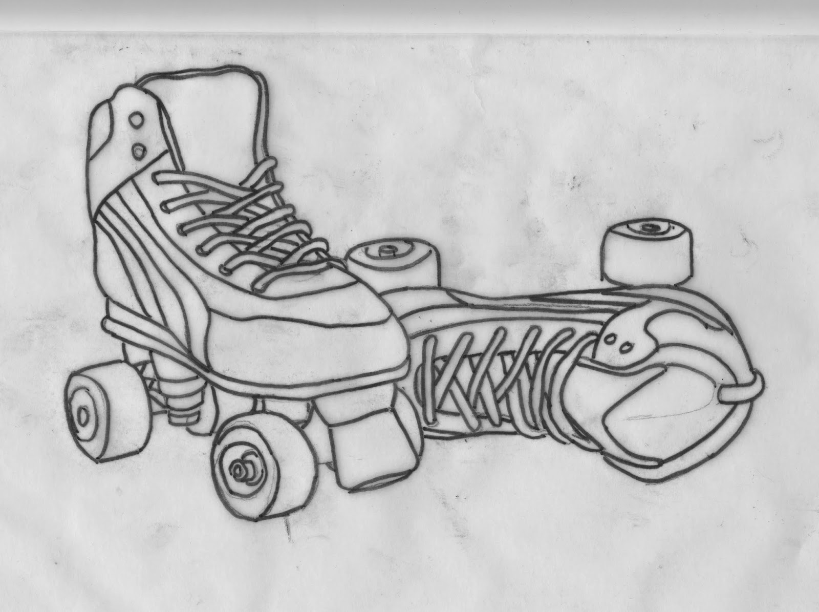
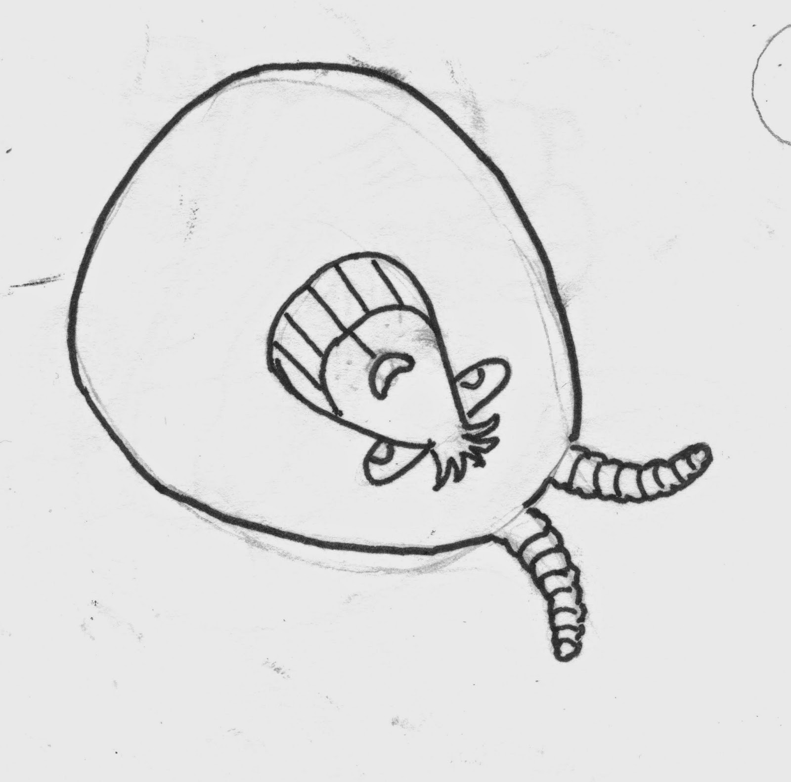
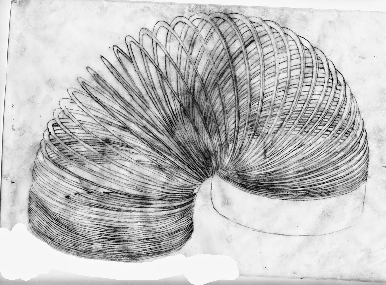
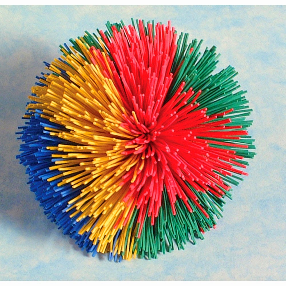
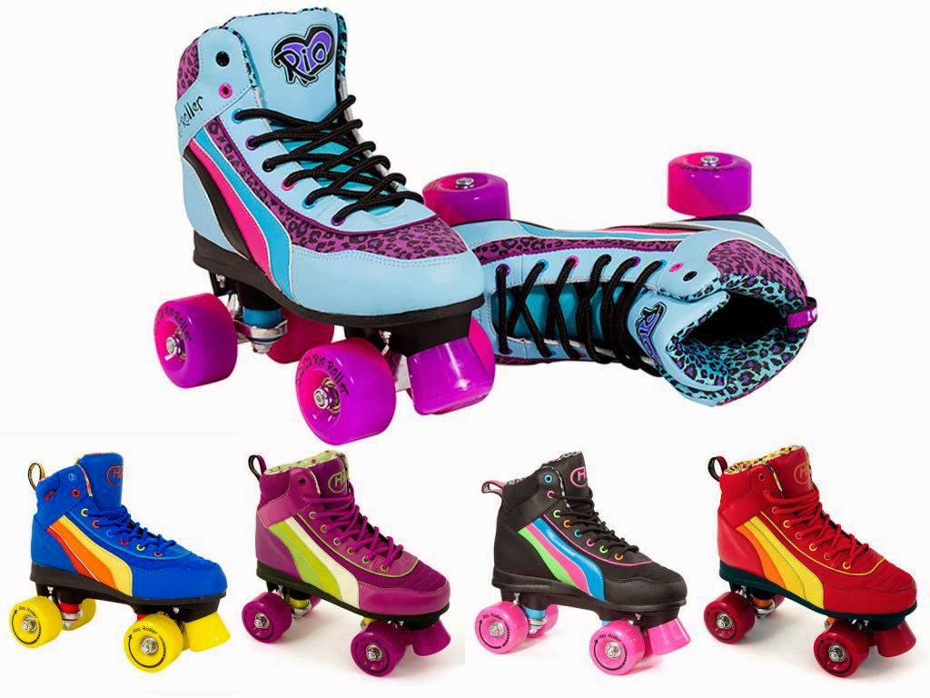
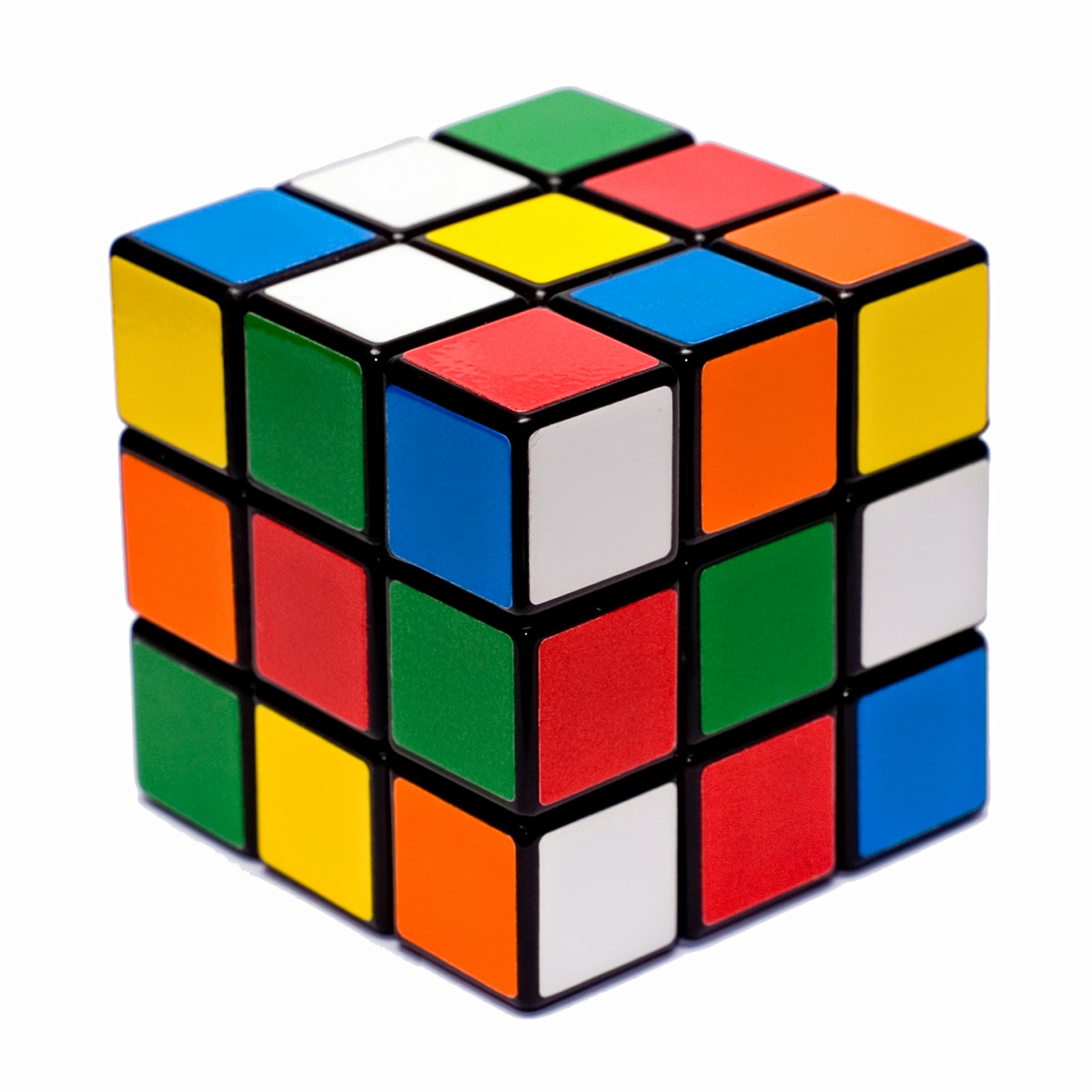
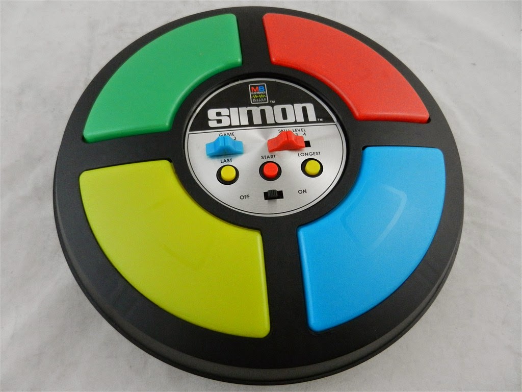
Here are some of the illustrations I have produced for the 80's toy box conversational pattern brief, the next stage is to digitize and vectorize them to allow me to lay it out in a Cath Kidston like style
YCN Cath Kidston // Initial Ideas
Having sat down and talked with both my sisters who fit the exact target market of Cath Kidston, I asked for there help to come up with a list of possible visual options that the pattern could consist of.
Chocolate
Cats / Dogs
Puppies / kittens
Baking
Knitting
Tea
Alcohol
Cocktails
Picnic
Wine
Comfort
Bed
Holidays
Beaches
Cities
Travel
Music
Candles
Books / reading
Birds
Nature
Flowers
Pillows/ Throws
Animals
Out of this I thought perhaps a topic a little more generic would be the best options so I thought some sort of animal based parrtern would create quite a good conversational pattern, especially if it was an animal that wasn't usually associated with feminine patterns
Penguins was my first option, but after illustrating about 10 different penguins I realised that perhaps my concept behind the conversational pattern was a little too vague.
Then I went onto thinking about the age range of the target audience and perhaps playing on their childhood memories.
So I then thought about
Cartoons from the 80's but was worried that it would be difficult to produce without breaking copyright laws.
Then continuing on that thought I developed the idea of basing the pattern around 80's popular childrens toys
This concept would work well I think for the age range and target audience that Cath Kidston aims towards plus it also is quite a unique and different idea to anything cath kidston has produced which I think will benefit in the presentation.
Saturday 22 March 2014
YCN Cath Kidston // The brief
Cath Kidston
Design a new print for Cath Kidston.
Background
If you wanted to buy an ironing board cover in the early 1990s you had limited options. One: utilitarian grey. Two: 'comedy' – think a man in his underwear. Cath Kidston realised there must be a way to update something traditional with a modern, unexpected new look, and cheer up a dull chore in the process. Having recently opened a shop selling vintage fabrics, bits and pieces collected from flea markets, and car boot sales, and old furniture repainted in bright colours inspired by the interiors of her childhood home, it was inevitable that Cath would start designing her own prints and products. A floral print ironing board cover was one of the first Cath Kidston products and it caught the attention of customers and press alike, helping to establish the brand.20 years on we’re still cheering up the everyday with our fresh, witty take on design. We’re known for our original, practical products and cheerful, colourful prints which have a hint of nostalgia but are always fit for modern life.
We are The Home of Modern Vintage, and now have more than 130 stores worldwide.
Our brand is…
- Approachable and inclusive
- Warm and friendly
- Cheerful and fun
- Confident and quirky
- Imaginative and unique
- Modern and relevant
- Comforting and homely
- Straightforward and real
Our prints are…
- Contemporary classic but not retro repro
- Reinventing our favourites but not copying our past
- Coloured using a bold and distinctive palette
- Used in a fresh, surprising and modern way
… and based on our…
- British sense of humour and cheekiness
- English heritage
… but not…
- Too pretty, too sweet, too soft or too twee
- Too cluttered, too fussy or too busy
Our Target Customer is…
Female, 29 years old, has just moved in to her first proper home of her own, has a job she really enjoys, has a close group of friends and a family she values, she doesn’t have children yet… but she’s got plenty of friends who have.She’d describe herself as…
Fun, witty, interested, creative, optimistic and independent.Her style is…
- Stylist… but not trendy
- Individual… but not showy
- Feminine… but not cute
- Well put together… but not overly groomed
- Fashion conscious… but not slavishly so
She likes…
- Making stuff… be it food for friends or cushions for her new sofa
- Going out… but she usually remembers how she got home these days
- Festivals, car boots and vintage shopping
- Going to an exhibition… followed by a bit of reality TV
- The idea of country life… but not just yet
The Creative Challenge
Design one new conversational print taking into account our brand values and print style. Examples of conversational prints within our range would include Cowboy, Garden Birds, Guards of London – these are prints with a recognisable picture within them. Classic Cath Kidston floral, spots or stripes would not be described as a conversational print.The print should be designed to be used across three of our product categories; Women’s Fashion, Women’s Accessories and Home. We are looking for an original theme and a fresh new take on our unique visual style. Your print can take any visual direction you wish, as long as you believe it to be in tune with our brand.
A selection of entries will be exhibited at our new London flagship store at 180 Piccadilly (opening December 2013) during April 2014. All commended entries will be considered for a 12 month internship within our Print Design team.
Creative Requirements
Please submit the print in both repeat tile and stepped out versions, and create three different colourways. You should use a maximum of 12 colours.Additional Information
For more information and to view our entire product range visit cathkidston.comDeliverables, Artwork and Additional Information
For guidance on how to submit your work, please adhere to the main deliverables information which can be found here.Any additional supporting information referenced in the brief can be found in the supporting project pack.
Monday 3 March 2014
Isobel Moore Photography // Business card development
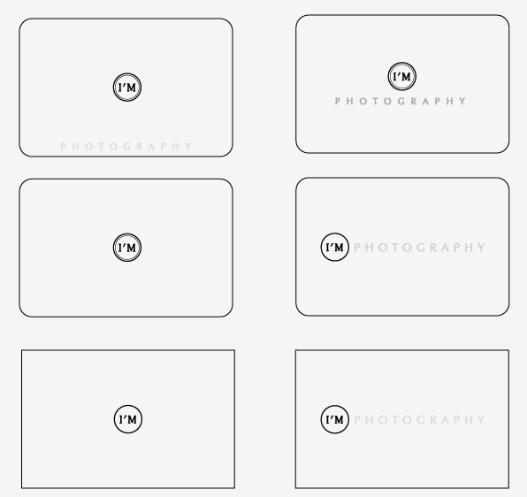
Below you can see the various options that I produced for Isobel to choose from, She wasn't sure if she wanted her photography on her business card or just to have her logo and information, so I gave her a few possible options of each
I also gave her alternate potions for shape if she didn't want a standard 85mm x 55mm business card. She did decide from this that she would prefer a card with curved corners and we managed to find a printers called moo.com that prints curved edged business cards at a reasonable price.
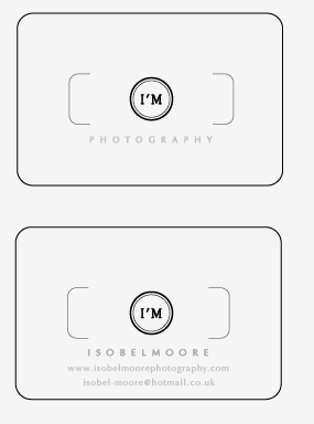
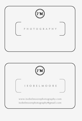
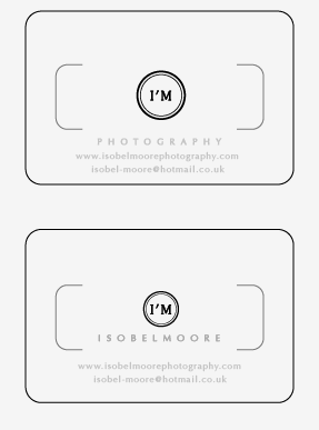
These were more the style she was after, I found out on a meeting we had, I really wanted to keep the card as simple and clean as possible, to give it a high quality feel, as the serif fonts that are used give quite a high quality feel to her branding.
At this stage this is when I started to amend the layout of the actual logo, to allow better ledgibitlity especially at a smaller scale.
Subscribe to:
Posts (Atom)
