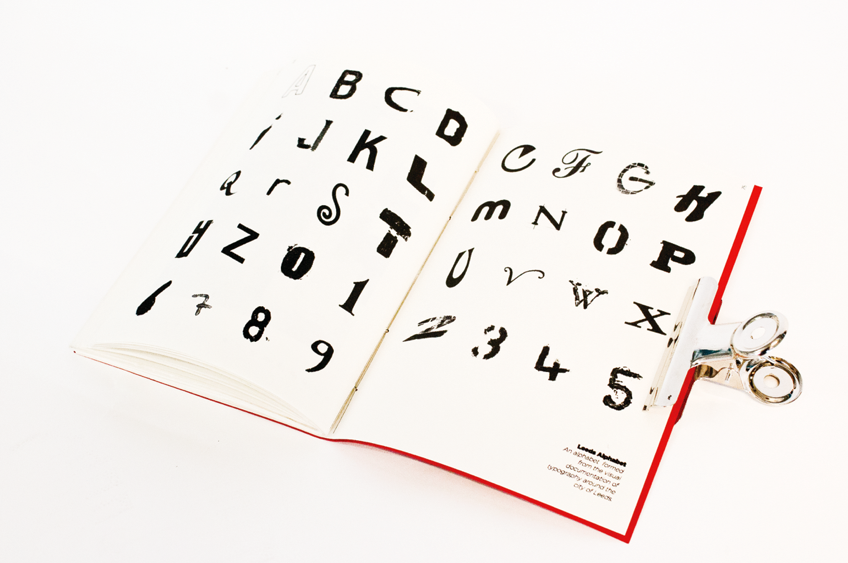
I have printed the publication on Antique white paper, which is matt and not grainy so the printed finish is really good, even though it did take 4 hours to print because of problems with the digital printers in the digital dungeon but I am glad I put the time in, but i am still going to get it professionally printed as i think this brief deserves a nice finish.
As you can see below here are a few product shots of the final publication, these have actually come out well, much nicer than I expected to get from that publication.


No comments:
Post a Comment