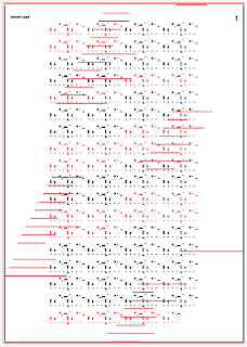
Having got to a stage of this brief where I was happy and had received good feedback, the next stage was to play around with the layout of the posters which i will follow for the remaining 2 songs I decide to dissect, notate and visualise.
I am relying the production stage of this project to produce a high quality finish on these posters so i want to keep them quite simple to not take away from the main feature. However I feel like something is missing from the poster so i am using this stage to play around with layouts and alternative ways of interpreting the pattern.
In this case i separated each section of the song into individual vertical rows (introduction - verse - chorus etc..). The aesthetic was quite interesting but I think it is a little too abstract and difficult to follow. I also started to play around with the idea of adding black keys to incorporate another musical element but decided this was a little too convoluted as the pattern represents purely the rhythmical elements of the song.
I thought I would try taking the design in a little different direction by playing around with the colour scheme, I was inspired by one of the designs I saw in 'Data Flow' so thought i might try a similar colour scheme or atleast see what it looks like.
I decided to try a couple of variations of how the pattern would be presented, instead of having each voice on a different layer I reverted to an earlier idea which was to merge all the voices into one row, this makes it pretty much impossible to follow but for aesthetic purposes it is quite unique and is still technically accurate.
I used this format and applied it to the new colour scheme and was quite pleased with the outcome, it kind of reminds me of Japanese style design with the thin downward rows, similar to how type is laid out in many japanese designs.
I then went on to layer the original rhythm pattern I created over the top which added an extra visual element, which I thought accompanied the additional pattern well.
By adding the extra colour I have reached my maximum
allowance, but I quite liked the cantrst of the blue and the red but the
black just disappears into the background.
I altered the the secondary colour of the pattern from black to white and just stroked the white to give it a variation between the sections that wasn't just colour, I think this layout again is quite unique and also in this instance makes it quite easy to follow if it is wished.
another variation of the same layout this time with solid white instead of stoked, this creates a much more intense contrast which I really like, it pops out from the blue and really helps the shape that is created by the colour alterations of the rhythm pattern.
A final idea for the poster layout, making the pattern I started with full page, with a thin stroke, this creates a cool aesthetic where the pattern blends nicely with the deep blue background but I think because of the scale when it would be printed it would be nicely clear.
I also really like the positioning of the song title and artist, it adds a nice clean and simple element to the poster which is a refreshing variation to normal placements.
The next stage is for me to take my design options and get them crit in the studio, this has been scheduled for Monday afternoon with Martin and Luke and who ever else is available to give constructive feedback.


No comments:
Post a Comment